
michael betancourt
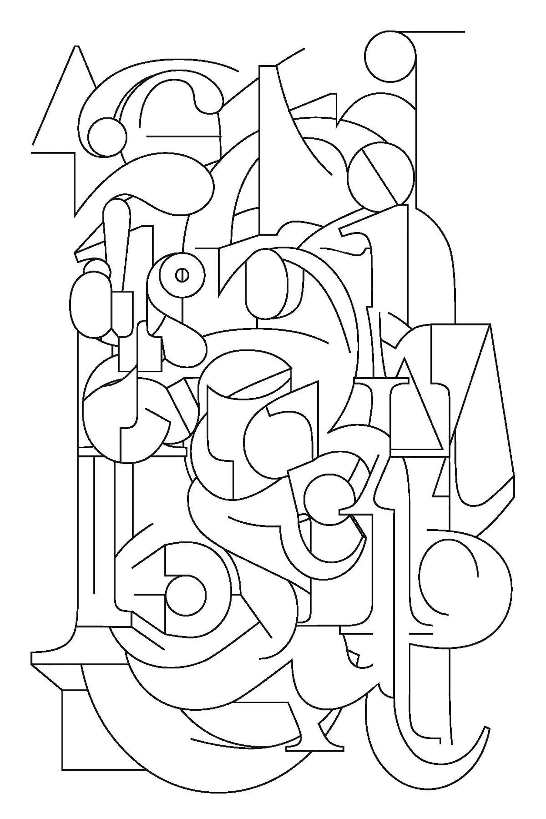
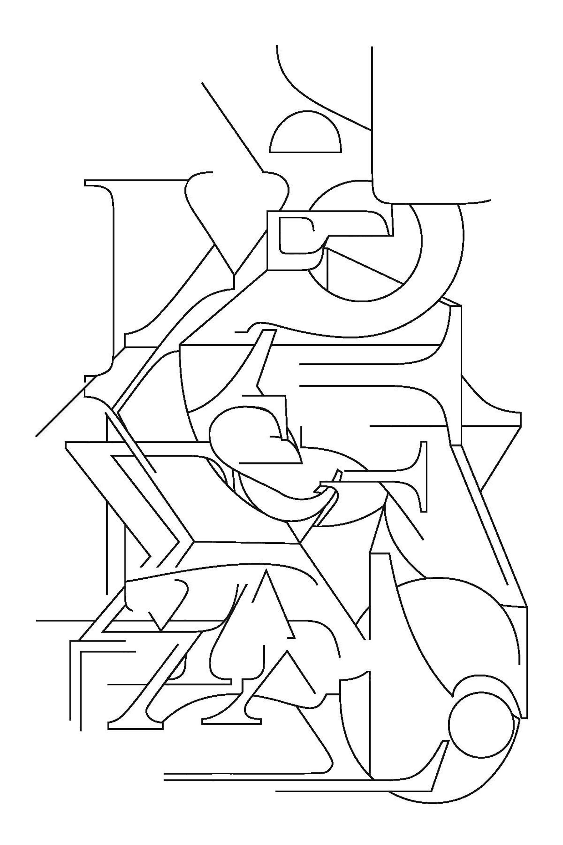
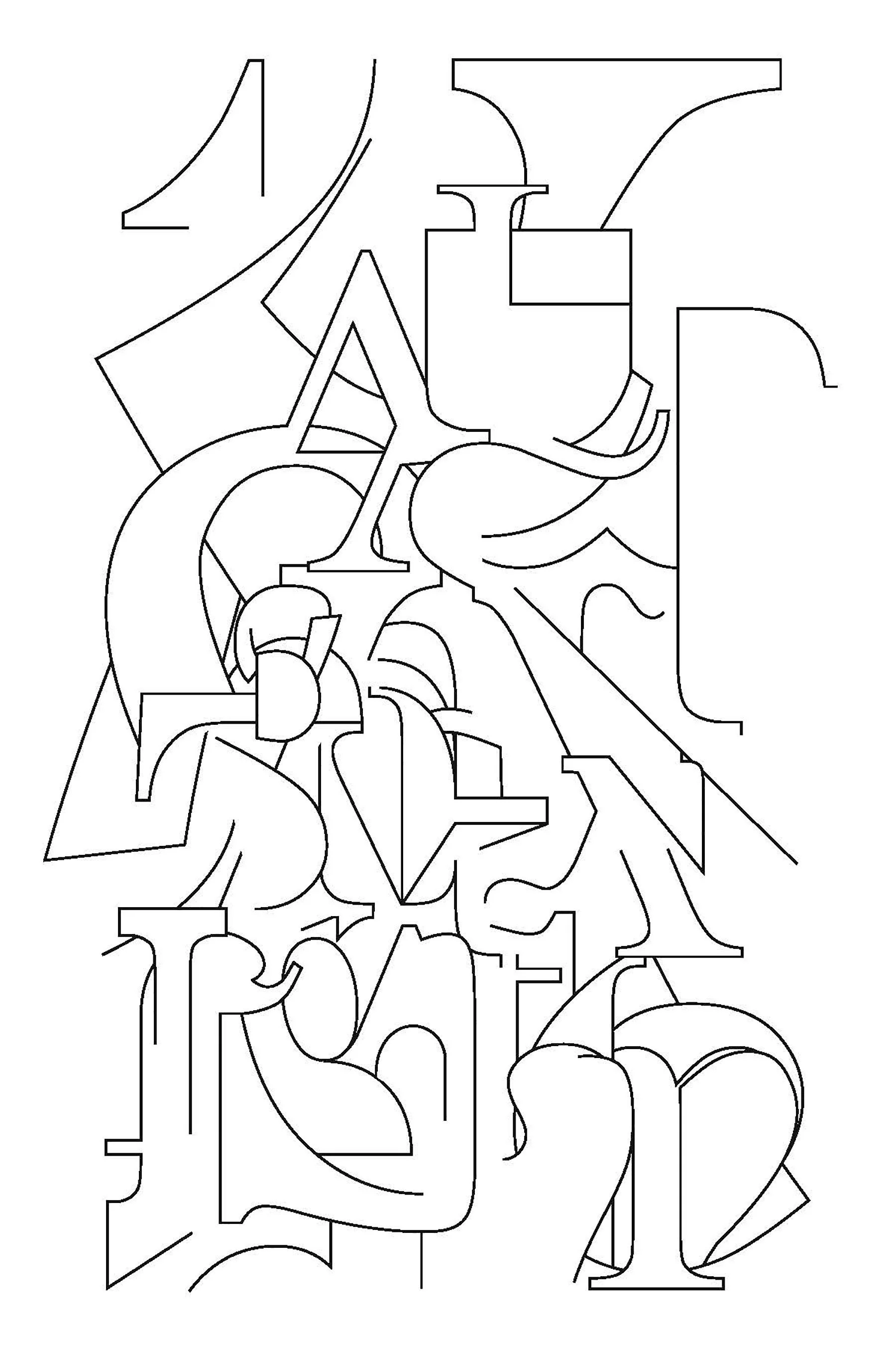
typoetry
I once had an experience while driving behind a truck with a big logo painted on the back—large, gothic capitals—that simply refused to resolve into coherent lettering for me. There were letters there and I could recognize that the curves and uprights were text, but it refused to become coherent as lettering. Making typoetry is my attempt to explore that experience, to modulate the recognition of lettering without the need to always or consistently produce letters, words, or lexical statements.
-Michael

michael betancourt
Michael Betancourt’s typographical asemic poetry has been published by Red Fox Press, Timglaset, Post–Asemic Press, and nOIR:Z, as well as in Die Lerre Mitte, To Call magazine, aurapoesiavisual, and Utsanga.it. More information is available online at michaelbetancourt.com